
Q4 2015 Site Performance Report

Happy New Year! It may be 2016, but we’re here to give you a full review of the site performance highlights for the fourth quarter of 2015. For this report, we’ve collected data from a full week in December that we will be comparing to the full week of data from September we gathered for our last report. Unlike the Q3 report, we did not uncover any prevailing trends that spanned every section of this report. In the fourth quarter, we saw a few improvements and a handful of regressions, but the majority of pages remained stable.
As in the past, this report is a collaborative effort. Mike Adler will discuss our server side performance, Kristyn Reith will report on the synthetic front-end data, and the real user monitoring update will come from Allison McKnight and Moishe Lettvin. So without further delay, let’s take a look at the numbers.
Server-Side Performance
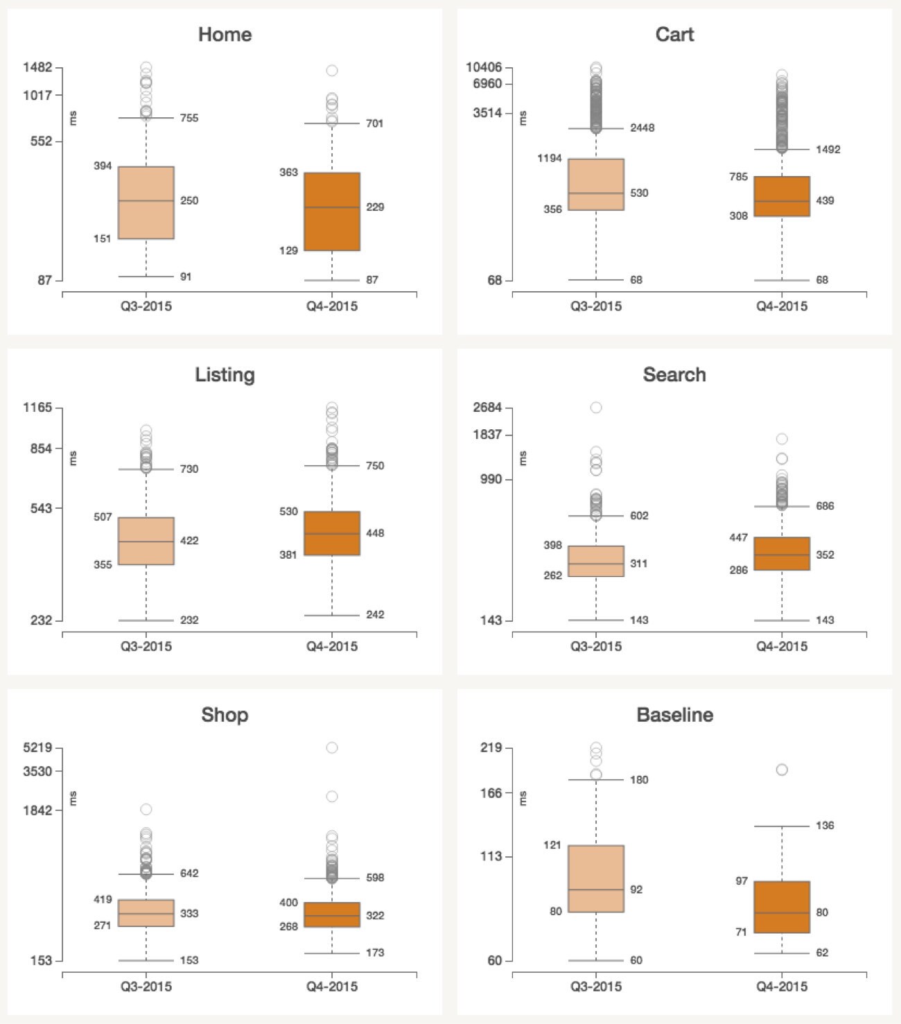
We begin our report with the server-side latencies, which is how long it takes for our servers to build pages. This metric does not include any browser-side time. We calculate it by taking a random sample of our web server logs. One reason we start here is that changes in server-side metrics can explain some changes in synthetic and RUM metrics. As you can see below, most pages are executing on the server at about the same speed, though the cart page did get about 27% faster on average.
The fourth quarter of the year obviously includes holiday shopping, which is the busiest time of year for our site. Each year our ops team plans to add capacity in anticipation of the rush, but still, it's not unusual to discover new performance bottlenecks as traffic ramps up. Each year we have new code, new hardware and new usage patterns. To quote a translation of Heraclitus, "Ever-newer waters flow on those who step into the same rivers."
In this quarter we discovered that we could improve our efficiency by running numad on our web servers. Our web servers do not use any virtualization, so one kernel is scheduling across 24 physical cores (hyper-threading disabled, for now). We noticed that some cores were significantly busier than others and that was effectively limiting throughput and increasing latency. An Etsy engineer learned that by simply running numad, the cpu workload was more balanced, leading to better efficiency. In short, our server-side metrics no longer slowed down during busy times of the day.
Today's servers are built with NUMA (Non-uniform memory access) architectures, which creates an incentive to schedule a tasks on CPUs that are "close" to the memory they need. Depending on many factors (hardware, workload, other settings), this scheduling challenge can result in suboptimal efficiency. We found that numad, a userland daemon that assigns processes to numa zones, is a simple and effective way to optimize for our current conditions.
We saw that our search page performance got a little slower on average, but we expected this due to launching some more computationally expensive products (such as our Improved Category Pages).
Synthetic Start Render
For our synthetic testing, we’ve set up tests using a third party service which simulates actions taken by a user and then automatically reloads the test pages every ten minutes to generate the performance metrics. As mentioned in the last report, due to recent product improvements, we have decided to retire “Webpage Response” as a metric used for this report, so we will be focusing on the “Start Render” metric in the boxplots below. Overall, we did not see any major changes in start render times this quarter that would have impacted user experience.
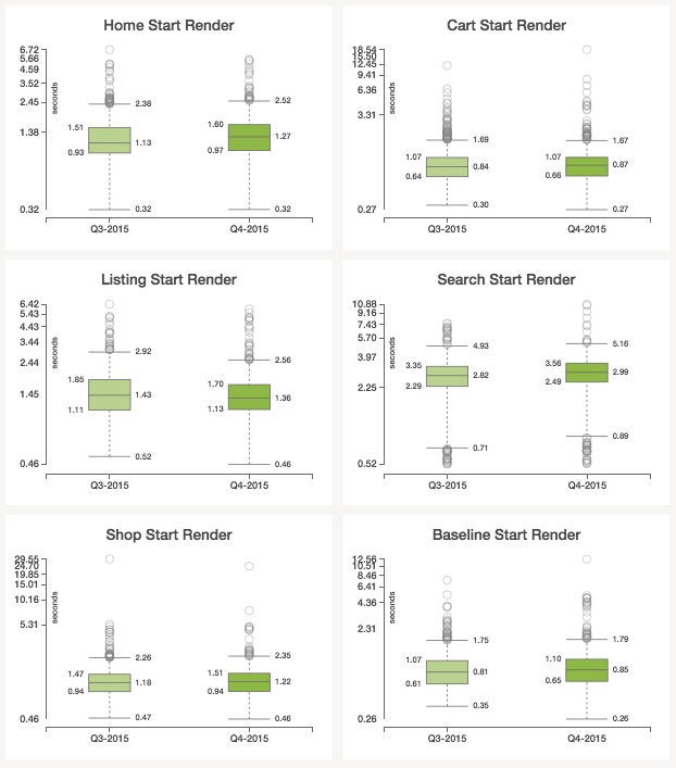
You may notice that the metrics for Q3 differ from the last report and that the start render times have significantly wider ranges. In the last two reports the plotted data points have represented median measurements, which limited our analysis to the median metrics. In this report, the boxplots are constructed using raw data, thereby providing a more accurate and holistic representation of each page’s performance. Since the raw data captures the full distribution of start render times, we are seeing more outliers than we have in the past.
As you can see above, the start render time has remained fairly stable this quarter. Though nearly all the pages experienced a very minor increase in median start render time, the homepage saw the greatest impact. This slowdown can be attributed to the introduction of a new font. Though this change added additional font bytes to all the pages, we discovered that the scope of the regression significantly varied depending on the browser. The data displayed in the boxplots is from tests run in IE9. The graphs below show the days surrounding the font change.
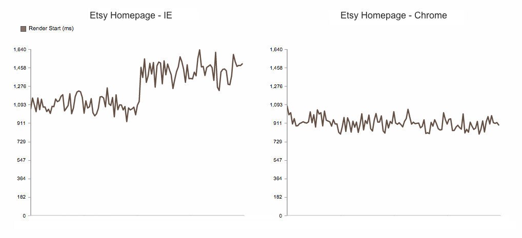
While the font change resulted in a noticeable jump in start render time in IE, start render performance in Chrome remained relatively unaffected . The difference in font file formats displayed by the browsers is partially responsible for the disparity in performance. The font format selected by Chrome (woff2) uses a compression algorithm that reduces the font file by roughly 30%, resulting in a substantially smaller file size when compared to other formats. Additionally, the IE browser running the synthetic test has the compatibility view enabled, meaning that although it’s effectively using IE9, the browser is rendering the pages with an even older version of IE. Therefore, the browser is downloading all the font files included in the pages corresponding CSS file regardless of whether or not they are used on the page.
Since Chrome is more commonly used among Etsy users than IE9, we have set up new synthetic tests in Chrome. For all future reports we will use the data generated by the new Chrome tests to populate the synthetic boxplots. We feel that this change, coupled with the continued use of raw data will provide a more realistic representation of what our users experience.
Real User Page Load Time
“Real User” data can show us variations in the actual speed that our users experience, depending on their geographic location, what browser they’re using, the internet provider they’re using, and so on. Sometimes the richness of this data lets us see trends that we couldn’t see in our other two monitoring methods; other times, the variety of data makes trends harder to see.
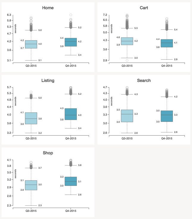
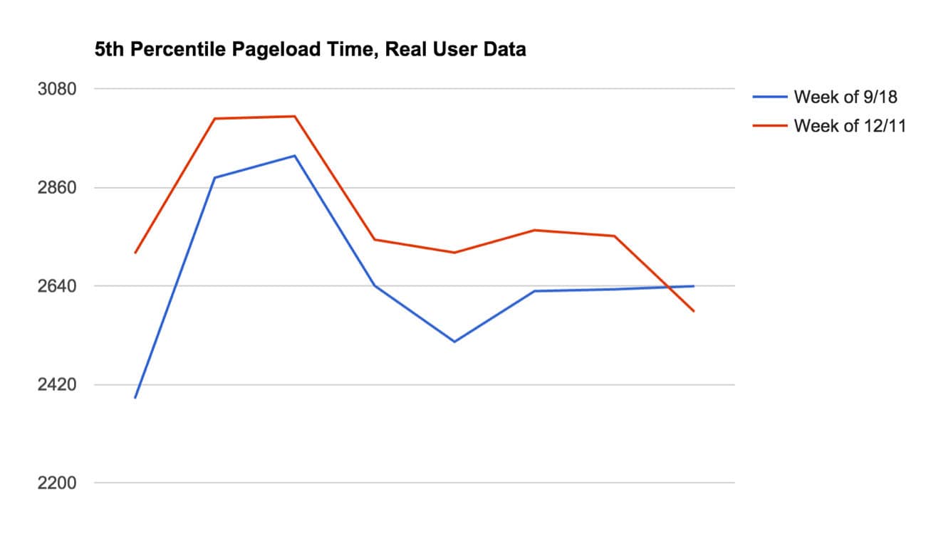
This quarter, we mostly saw small or no change in our metrics. The only delta that’s noticeable is the fifth percentile in the Shop Home page, which increased from 2.3 seconds to 2.6 seconds. A time series graph of the fifth percentile shows an uptick corresponding to our new page font. This parallels what we found in the synthetic tests, as discussed above.
Because shop_home is one of our most-consistently fast pages, it tends to be more sensitive to changes in overall site load time. That is, it shows deltas that might get “lost in the noise” on pages with higher variance.
With this context, it can be interesting to look at the data day-by-day in addition to the week vs. week comparison that the box plot above shows us too. You can see below that even with the fairly large difference in the fifth percentile seen in the box plot, on the last day of the comparison weeks the slower and faster lines actually trade positions.
Conclusion
Despite the fourth quarter being the busiest time of the year, users did not experience degraded performance and most of the fluctuations in page speed were negligible. For this report we improved the data quality in the synthetic section by switching from median measurements to raw data. In the coming 2016 reports, we will strive to make more improvements to our methodology. If you have any thoughts or questions, please leave a comment!