
Q2 2015 Site Performance Report

We are kicking off the third quarter of 2015, which means it’s time to update you on how Etsy’s performance changed in Q2. Like in our last report, we’ve taken data from across an entire week in May and are comparing it with the data from an entire week in March. We’ve mixed things up in this report to better visualize our data and the changes in site speed:
- For backend performance, we randomly sampled 1% of our data for all pages except the baseline page and we will be looking at that sampled data for the aforementioned weeks from each quarter. We are using the full set of data for each week for the baseline page as it gets very little traffic.
- We are using box plots to represent the data in each section. For the synthetic and real user monitoring portions, the data points plotted are median measurements.
- For listing and shop pages in the synthetic section, we are using a slightly different date range (the first week of April). This is to compare apples to apples; as we noted in our last report, we had an issue in which the shop we were monitoring changed state.
- We added the cart page to this quarter’s report. Since we have only just started measuring cart this quarter, we do not have data from March to measure it against; however, moving forward cart will continue to appear in all our quarterly reports.
As in the past, we’ve split up the sections of this report among members of our performance team. Allison McKnight will be reporting on the server-side portion, Kristyn Reith will be covering the synthetic front-end section and Natalya Hoota will be providing an update on the real user monitoring section. We have to give a special shout out to our bootcamper Emily Smith, who spent a week working with us and digging into the synthetic changes that we saw. So without further ado, let’s take a look at the numbers.
Server-Side Performance
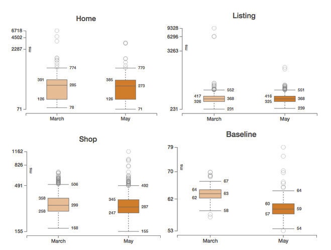
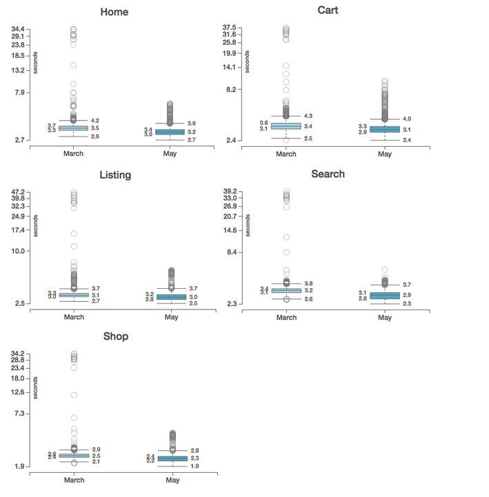
Taking a look at our backend performance, we see that the quartile boundaries for home, listing, shop, and baseline pages haven’t changed much between Q1 and Q2. We see a change in the outliers for the shop and baseline pages - the outliers are more spread out (and the largest outlier is higher) in this quarter compared to the last quarter. For this report, we are going to focus on analyzing only changes in the quartile boundaries while we work on honing our outlier analysis skills and tools for future reports.
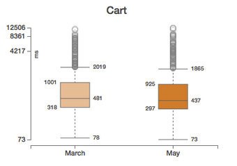
On the cart page, we see the top whisker and outliers move down. During the week in May when we pulled this data, we were running an experiment that added pagination to the cart. Some users have many items in their carts; these items take a long time to load on the backend. By limiting the number of items that we load on each cart page, we improve the backend load time for these users especially. If we were to look at the visit data in another format, we might see a bimodal distribution where users exposed to this experiment would have clearly different performance than users who didn't see the experiment. Unfortunately, box plots limit our view on whether user experience could be statistically divided into two separate categories (i.e. multimodal distribution). We’re happy to say that we launched this feature in full earlier this week!
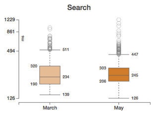
This quarter, the Search team experimented with new infrastructure that should make desktop and mobile experience more streamlined. On the backend, this translated into a slightly higher median time with an improvement for the slower end of users: the top whisker moved down from 511 ms to 447 ms, and the outliers moved down with it. The bottom whisker and the third quartile also moved down slightly while the first quartile moved up.
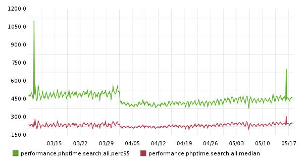
Taking a look at our timeseries record of search performance across the quarter, we see that a change was made that greatly impacted slower loads and had a smaller impact on median loads:
Synthetic Start Render and Webpage Response
Most things look very stable quarter over quarter for synthetic measurements of our site’s performance.
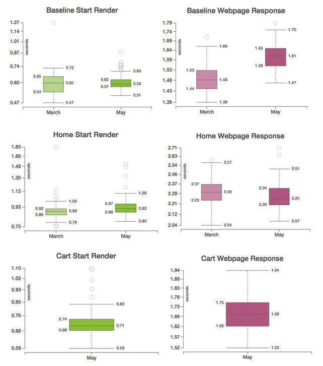
As we only started our synthetic measurements for the cart page in May, we do not have quarter-over-quarter data.
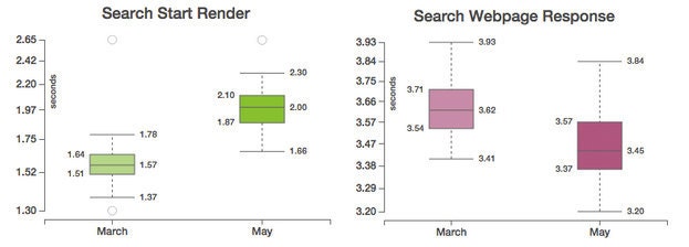
You can see that the start render time of the search page has gotten slower this quarter but that the webpage response time for search sped up. The regression in start render was caused by experiments being run by our search team, while the improvement in the webpage response time for search resulted from the implementation of the Etsy styleguide toolkit. The toolkit is a set of fully responsive components and utility classes that make layout fast and consistent. Switching to the new toolkit decreased the amount of custom CSS that we deliver on search pages by 85%.
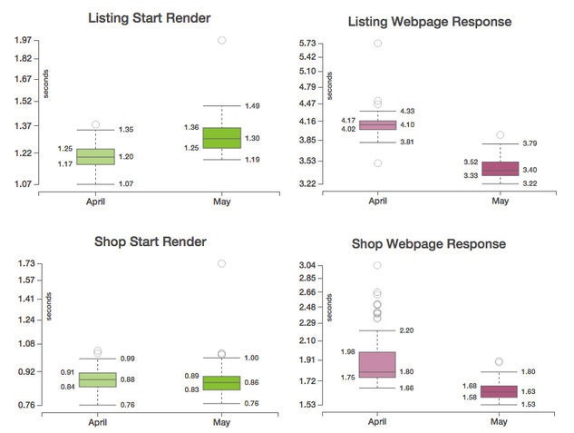
As noted above, we are using a slightly different date range for the listing and shop data so that we can compare apples to apples. Taking a look at the webpage response time box plots, we see improvements to both the listing and shop pages. The faster webpage response time for the listing page can be attributed to an experiment running that reduced the page weight by altering the font-weights. The improvement to shop’s webpage response time is the result of migrating to a new tag manager that is used to track the performance of outside advertising campaigns. This migration allowed us to fully integrate third party platforms in new master tags which reduced the number of JS files for campaigns.
Real User Page Load Time
The software we use to measure our real user measurements, mPulse, was updated in the middle of this quarter, leading to a number of improvements in timer calculation and data collection and validation. Expectedly, we saw a much more comprehensive pattern in data outliers (i.e., values falling far above and below the average) on all pages, and are excited for this cleaner data set.
Since Q1 and Q2 data was collected with different versions of the real user monitoring software, it would not be scientifically accurate to make any conclusions about our user experiences this quarter relative to the previous one. It definitely looks like an overall, though slight, improvement sitewide, a trend which we hope to keep throughout next quarter.
Conclusion
Although we saw a few noteworthy changes to individual pages, things remained fairly stable in Q2. Using box plots for this report helped us provide a more holistic representation of the data distribution, range and quality by looking at the quartile ranges and the outliers. For next quarter’s report we are really excited about the opportunity to continue exploring new, more efficient ways to visualize the quarterly data.