Opsweekly: Measuring on-call experience with alert classification
The Pager Life
On-call is a tricky thing. It's a necessary evil for employees in every tech company, and the responsibility can weigh down on you. And yet, the most common thing you hear is "monitoring sucks", "on-call sucks" and so on. At Etsy, we've at least come to accept Nagios for what it is, and make it work for us. But what about on-call? And what are we doing about it? You may have heard that at Etsy, we're kinda big into measuring everything. "If it moves, graph it, if it doesn't move graph it anyway" is something that many people have heard me mutter quietly to myself in dark rooms for years. And yet, for on call we were ignoring that advice. We just joined up once a week as a team, to have a meeting and talk about how crappy our on-call was, and how much sleep we lost. No quantification, no action items. Shouldn't we be measuring this?
Introducing Opsweekly
And so came Opsweekly. Our operations team was growing, and we needed a good place to finally formalise Weekly Reports.. What is everyone doing? And at the same time, we needed to progress and start getting some graphs behind our on-call experiences. So, we disappeared for a few days and came back with some PHP, and Opsweekly was born.
What does Opsweekly do?
In the simplest form, Opsweekly is a great place for your team to get together, share their weekly updates, and then organise a meeting to discuss those reports (if necessary) and take notes on it. But the real power comes from Opsweekly's built in on call classification and optional sleep tracking.
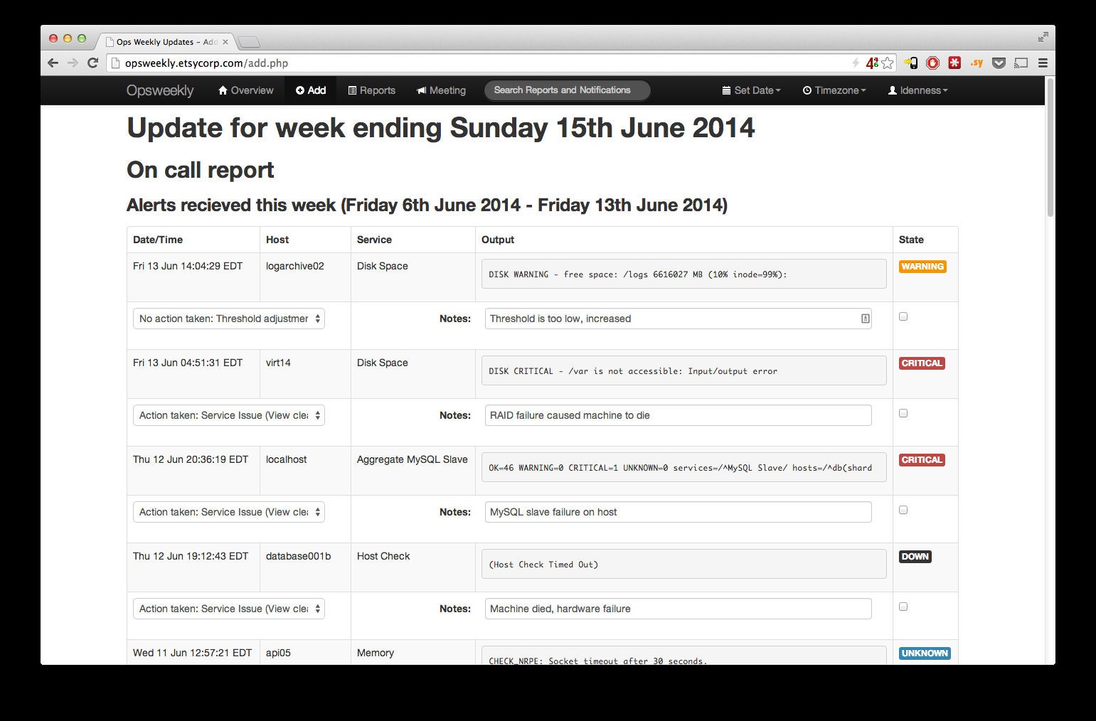
Every week, your on-call engineer visits Opsweekly, hits a big red "I was on call" button, and Opsweekly pulls in the notifications that they have received in the last week. This can be from whichever data source you desire; Maybe your Nagios instance logs into Logstash or Splunk, or you use Pagerduty for alerting.

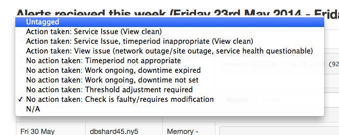
The engineer can make a simple decision from a drop down about what category the alert falls into.

We were very careful when we designed this list to ensure that every alert type was catered for, but also minimising the amount of choices the engineer had to try and decide from.
The most important part here is the overall category choice on the left:
Action Taken vs No Action Taken
One of the biggest complaints about on call was the noise. What is the signal to noise ratio of your alert system? Well, now we're measuring that using Opsweekly.

This is just one of the many graphs and reports that Opsweekly can generate using the data that was entered, but this is one of the key points for us: We've been doing this for a year and we are seeing an increasingly improving signal to noise ratio. Measuring and making changes based on that can work for your on-call too.
The value of historical context
So how does this magic happen? By having to make conscious choices about whether the alert was meaningful or not, we can start to make improvements based on that. Move alerts to email only if they're not urgent enough to be dealt with immediately/during the night. If the threshold needs adjusting, this serves as a reminder to actually go and adjust the threshold; you're unlikely to remember or want to do it when you've just woken up, or you've been context switched. It's all about surfacing that information. Alongside the categorisation is a "Notes" field for every alert. A quick line of text in each of these boxes provides invaluable data to other people later on (or maybe yourself!) to gain context about that alert. Opsweekly has search built in that allows you to go back and inspect the alert time(s) that alert fired, gaining that knowledge of what each previous person did to resolve the alert before you.
Sleep Tracking
A few months in, we were inspired by an Ignite presentation at Velocity Santa Clara about measuring humans. We were taken aback... How was this something we didn't have?
Now we realised we could have graphs of our activity and sleep, we managed to go a whole 2 days before we got to the airport for the flight home to start purchasing the increasingly common off the shelf personal monitoring devices.
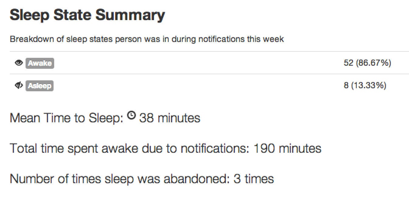
Ryan Frantz wrote here about getting that data available for all to share on our dashboards, using conveniently accessible APIs, and it wasn't long until it clicked that we could easily query that data when processing on call notifications to get juicy stats about how often people are woken up. And so we did:

Personal Feedback
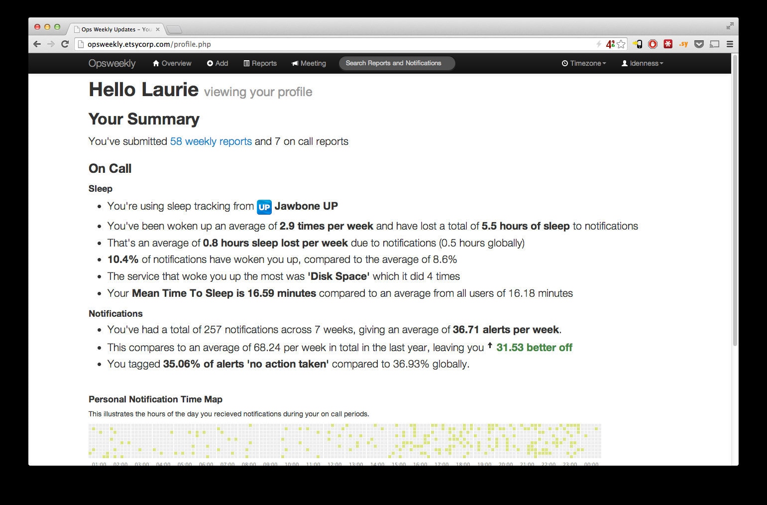
The final step of this is helping your humans understand how they can make their lives better using this data. Opsweekly has that covered too; a personal report for each person

Available on Github now
For more information on how you too can start to measure real data about your on call experiences, read more and get Opsweekly now on Github
Velocity Santa Clara 2014
If you're attending Velocity in Santa Clara, CA next week, Ryan and I are giving a talk about our Nagios experiences and Opsweekly, entitled "Mean Time to Sleep: Quantifying the On-Call Experience". Come and find us if you're in town!
Ryan Frantz and Laurie Denness now know their co-workers sleeping patterns a little too well...


